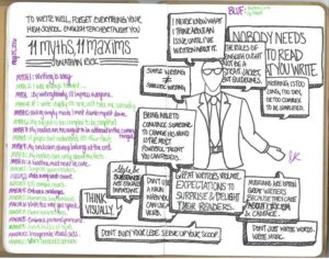
Visual aids make writing easier and reading more enjoyable.
Smart writers know a secret. They know that what you write — your choice of words — is only half of any project. The other half? How those words look — everything from your font size to your margin widths. Packaging and presentation matter more than most people appreciate.
This is one reason stores like Gucci and Whole Foods can charge a premium: The layout of their bricks and mortar gives rise to a certain appearance and ambiance. By contrast, while I have nothing against Marshalls or Giant Food, when it comes to aesthetics, their displays just can’t compete.
Now I know what you’re thinking: “I’m a writer, not a designer. I live in Word, not Photoshop. And good prose is good prose, whether it’s formatted in Calibri or Courier or Comic Sans.”
All true. And yet, a smart writer knows that for his words to have impact, they need to be visually communicable. They need to be digestible, snackable, even scannable in this age when the human attention span is shorter than that of a goldfish.
Happily, these formatting tricks don’t require any great expertise. To the contrary, formatting often flows from common sense. Indeed, of all a writer’s skills, visual aids may be the easiest.
The Quintessential Eyesore
For example, consider long paragraphs. As Brian Clark of Copyblogger puts it, These “blocks of text are inherently unfriendly.” That’s because the human eye reacts to things that are dense, things that it can’t take an overview of quickly, by glazing over them. The human mind works the same way: Show someone a book the length of War and Peace, and he’ll immediately procrastinate.
Faced with these facts, the amateur writer will take the easy way out: He’ll make his copy shorter. That’s a mistake; there’s a difference between making something shorter and making it more readable.
The professional writer focuses on the latter. To combat reader fatigue, he reaches into his toolkit and pulls out a visual aid. He adds headings to break up a report. He uses drop caps to provide visual variety in a proposal. He uses bullet points to emphasize key messages in a memo. (Other common aids include a numbered list, a pull quote, and a picture.)
What do all these techniques have in common? They create what’s called “white space,” or space on the page that’s empty and thus provides room for your grafs to breathe.
Why does writing need room to breathe? Because if we’re honest with one another, then we need to admit that words on a page or a screen are both boring and demanding. Put another way, reading is hard. (By contrast, it demands little mental energy to plop down before the boob tube or press play on your headphones.)
As a result, for the written word to be most effective, it needs to be decorated, it needs to be garnished. It’s no secret that every magazine and newspaper not only employs wordsmiths, but also designers. Ditto for restaurants, where chefs not only cook the food, but also drizzle the icing on your dessert plate in such a way to make you forget that you’re paying $15 for a scoop of ice cream.
Go Fight Human Nature
Still skeptical? Let me guess: Your work is too important to be sacrificed on the altar of paint-by-the-numbers gimmicks. Amirite?
Here’s the thing, though. That people will ruthlessly scan that which you’ve slaved over is a fact of life. As Brian Clark argues, “It’s better to accept this reality, and resolve to suck the scanners in,” than to try to transform the way the human mind processes information.
Should the world be this way? Ideally, no. “But it is,” adds Jonathan Morrow, another Copyblogger. “So, smart writers adapt. Smart writers learn how to command attention.” Smart writers learn how to pair their words with flair.
When every day brings forth yet another gimmick vying for readers’ consideration, smart writers avail themselves of every advantage they can.
Addendum (10/12/2017): My friend and colleague, Mike Long, just featured this presentation in his must-read e-newsletter, Mike’s Weekly Writing Tips!


