The best writers are also designers.
As many of you know, I teach business writing at the University of Maryland. The first presentation I deliver each semester is short and simple; the whole deck is 11 slides.
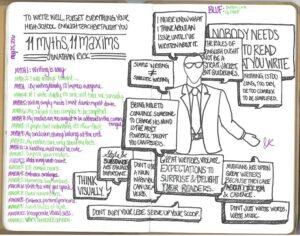
What can I convey in such limited space? It’s a mantra I repeat throughout the course, which I suspect that most of my students can recall well afterward: How your work looks can be as important as what it says.
In other words: To excel at writing, you need to master both form and function, both style and substance. You need to think visually.
As I explain in my larger workshop on visual aids, “Smart writers know a secret. They know that what you write — your choice of words — is only half of any project. The other half is how those words look — everything from your font size to your margin widths. Packaging and presentation matter more than most people appreciate.”
Indeed, the best writers aren’t just writers; they’re also designers, in the sense they care about how their words are displayed. As the Securities and Exchange Commission once observed, “The right design choices make a document easier to read and its information easier to understand. The wrong design choices can make even a well-written document fail to communicate.”
I came to this realization about a dozen years ago, when I worked for Booz Allen Hamilton (BAH), a well-known management consultancy. Before I got to Booz, I assumed that the firm won a lot of its work with the government because it hired a lot of high-ranking officials who previously worked there.
In truth, Booz won work (or at least made it to the final round) because its proposals were brilliantly designed. Leave aside the words and the ideas; the way these documents were formatted made an immediate impression that Booz was professional and polished.
That’s because its proposals didn’t consist, as most do, of long, boring blocks of text — walls of words that the human eye instinctively glazes over. Instead, a BAH proposal consisted of short paragraphs together with pictures and charts and bullet points. There was lots of white space, and even colors. As a result, what would otherwise be a chore to read became a pleasure.
No doubt, the pros at Booz Allen surely know what my students do: That how a document looks can be as important as what a document says.
Jonathan Rick helps people make sense of, and money from, business communication. Learn more about his clear-writing workshops and professional-development seminars.
A version of the above article appeared in Ragan on April 15, 2020.