When tweeting, most of us add an image only if it’s explicitly called for. For example, if we’re commenting on a facepalm by the White House chief of staff during a speech by the president, it makes sense to include the priceless pic.
Yet for the vast majority of content, the vast majority of people don’t think in visual terms. Instead, we put out the link along with some text, and leave it at that.
Realizing this, Twitter developed a “preview” feature, whereby links can automatically unfurl, thus providing a preview of the link without having to click on it. (This snapshot includes the headline, a one-sentence excerpt, and a cropped image.)
For most people, the preview is good enough. It’s certainly easy enough. Yet three news outlets have discovered a different, better way to tweet. Instead of allowing auto preview to do its thing, these publishers — @Mashable, @NRO, and @Slate — prefer to override the default settings and manually specify the picture for each tweet.
Confused? Let me explain by way of — what else — visuals. Consider this recent article from Slate. Here’s what an auto-previewed tweet looks like:
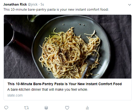
And here’s the same article, now tweeted with an image that was handpicked:
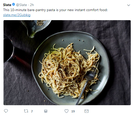
Notice the difference? Sure, the image is the same, but look closely and you’ll see that the former displays the headline twice — first in the actual tweet text, and then again in the auto preview. That’s just sloppy.
By contrast, the latter masks the preview, thus allowing Slate to employ its excellent headline without repetition. That’s sharp.
To be sure, there are a couple of drawback to the Mashable/NRO/Slate approach:
1. Finding and uploading an image can be tedious, especially if you’re tweeting dozens of times a day.
I too would feel this way, except for a time-saving trick known by most social media managers. Nearly every piece of professionally produced web writing includes some kind of visual. And the tools we managers use to tweet make the process to embed that visual truly effortless.
I know what you’re thinking. “C’mon — is this really ‘truly effortless’”? Yes, it is.
The beauty of the aforesaid tools (like Buffer) is that they automatically pull pictures from the webpage you’re tweeting about. You don’t have to copy and paste or even download and upload anything. And forget about Google Images and Shutterstock. All you need to do is to select a thumbnail that’s been preloaded.
If this isn’t effortless, I don’t know what is.
2. The second tweet suffers from a poor interface (what designers call “user experience”).
Look again at the first tweet. Here, the preview feature renders a large segment of the overall tweet clickable — everything from the top of the image down to the gray domain at the bottom (“slate.com”). By contrast, with the second tweet, people get only a few characters — the blue hyperlink (“slate.me/2Gubkig”) — to click.
In other words: What you may gain with the power of a proven headline, you lose dramatically in usability.
This is tough to argue with. But here’s the catch: The headlines that Slate publishes for each article are cleverly written and thoroughly optimized. As they should be — given how much time the publication invests in crafting them. (See this roundtable discussion by five editors on the subject, this indispensable reflection by writer Will Oremus, and this best-hits compilation by former writer Paul Smalera.)
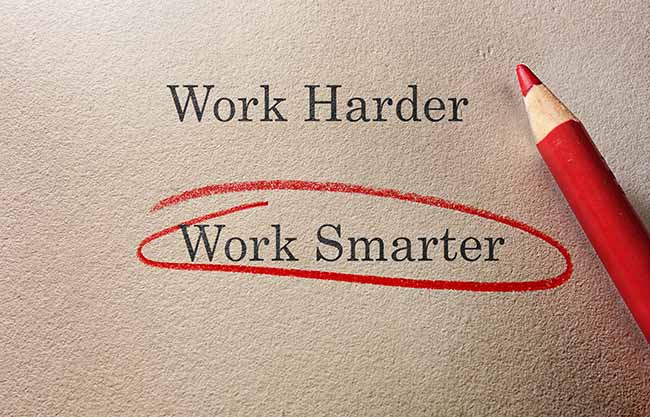
Thus, recycling these works of art makes sense from both a marketing viewpoint and a time-management one. Why spend energy rewriting something when the existing copy succeeds brilliantly? As our pre-social-media ancestors might point out, Technology should enable us to work smarter, not harder.
What do you think? Which strategy is best? (Feel free to chime in, @NewYorker, @Time, and @Wired.)
A version of the above article appeared in PR Daily on February 12, 2018.